
Summary of New Power BI Features

In January 2025, Power BI launched a series of new features and improvements that promise to optimize the user experience and enhance data analysis.
Below is a detailed summary of these updates and how they can benefit Power BI users.
1. Copilot and AI
Unlocking Suggested Questions
The unlocking of suggested questions feature in Copilot, which has been postponed to the February update, will allow users to access a new prompt that will help them explore their data through suggested questions. By selecting this prompt, three initial questions will be generated. If these are not useful, additional questions can be generated.

Additionally, authors will be able to customize these questions using the Q&A settings in Desktop for a specific semantic model. These suggested questions will appear in both Copilot and the Q&A visualization.
2. Reporting
Enhanced Data Exploration
One of the most notable updates is the new “Explore these data” option in the visual options menu.
This feature allows users to delve into datasets more intuitively and efficiently. With this tool, users can easily adjust their visualization (change the chart type, add new data, apply filters, and more!) and view the underlying data. This facilitates obtaining answers without the distractions and additional complexity of traditional reports. Additionally, it offers a more user-friendly and accessible interface, ideal for users without advanced technical training.


Integration with PowerPoint
The integration of Power BI with PowerPoint has received several significant improvements:
- Support for page up and down keys: Support for the page up and down keys has been added. This makes it easier to navigate through slides during the presentation. This improvement allows users to move quickly between slides, enhancing the fluidity of the presentation.
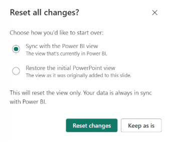
- New reset behavior: Now, narration in PowerPoint includes a new reset behavior. This allows users to return to the initial state of the presentation with ease. It is especially useful during live presentations, where it may be necessary to restart the narration to adapt to the audience’s needs.
Saving to OneDrive and SharePoint
The update to the file picker in Power BI includes several significant improvements:
- Pinning Files and Folders: You can pin and unpin files and folders to always have them at hand in the “Recent” section.
- Improved Navigation: It is now easier to navigate between folders and select files in OneDrive and SharePoint.
- Quick Access: You can quickly access your recent files and pinned folders.
- Creating Folders: It is possible to add new folders directly from the file picker.
Improvements in Text Filter (Preview)
The latest Power BI update introduces the ability to select multiple texts in the text filter. To enable this feature, go to Options and settings > Options > Preview features > Text filter visual and restart Power BI.
You can now add multiple texts to the filter to filter data more precisely. Type in the input box and apply the filter. The option to accept multiple values allows you to add more texts by repeating the process.
This new functionality offers improved control over data segmentation.
Improvements in Treemap Visualizations
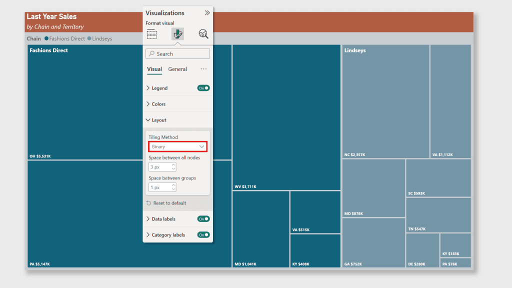
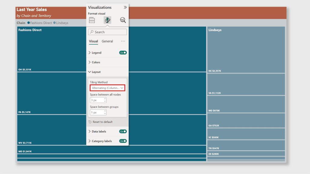
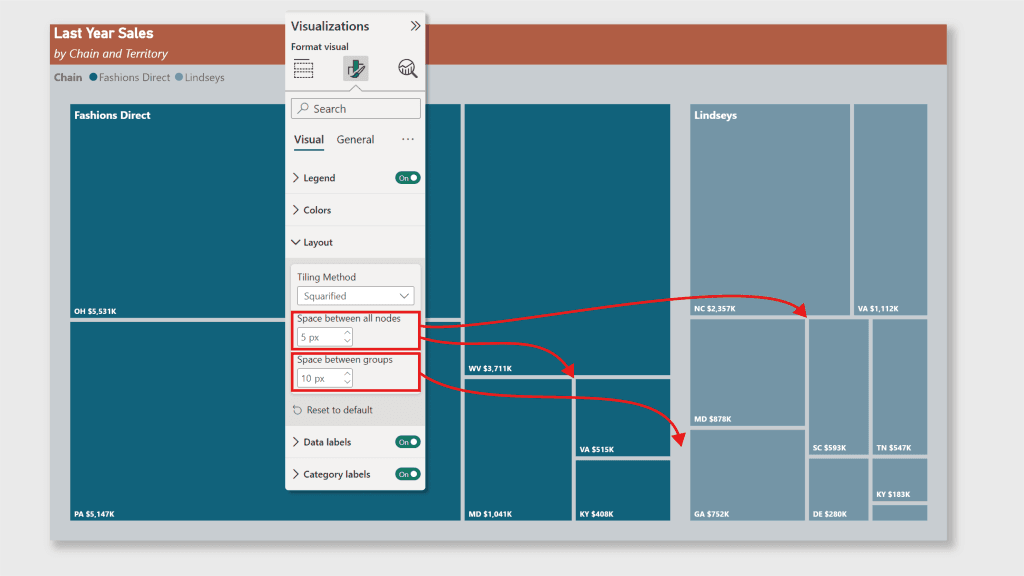
The January 2025 update includes significant improvements to the Treemap visual, with three new tiling methods and new spacing controls that enhance the appearance and usability of the visual.
Treemap visuals allow hierarchical data to be represented through nested rectangles, facilitating the comparison of proportions between different categories.
New Tiling Methods:
- Squarified: Uses an algorithm that avoids elongated rectangles, creating a balanced design with proportions close to squares.

- Binary: Continuously divides the chart area into two sections, creating a balanced and visually appealing Treemap.
- Alternating (columns, rows): Distinguishes categories by dividing them first by columns and then by rows, effectively organizing hierarchical datasets.
New Spacing Options:
- Space between all nodes: Introduces spaces between adjacent nodes, improving clarity.
- Space between groups: Adds additional space around each group of nodes, helping to visually distinguish categories.
3. Modeling and Data Connectivity
Semantic Model Version History (Preview)
This feature provides greater transparency and control over changes in data models, allowing users to revert to previous versions if necessary. It is especially useful in collaborative environments where multiple users can work on the same data model.
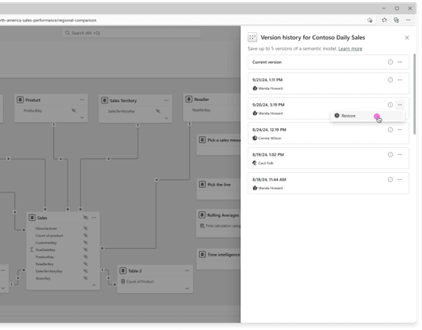
Additionally, you will have the option to manually save versions in the version history of your semantic model.

Editing Data Models in the Power BI Service (Preview)
Updates have been made to the ability to edit data models directly in the Power BI service.
- Preview enabled by default for Premium workspaces: With the new version of the semantic model history, the preview feature for editing data models in the service will be enabled by default in Premium workspaces. Power BI administrators can enable or disable this feature at the organization level or for specific security groups through the admin portal.
- View Mode: When opening semantic models on the web, the view mode will be set by default, allowing you to view the model in a secure environment without making accidental edits. To make changes, simply switch to edit mode.

Live Editing of Semantic Models in Direct Lake Mode with Power BI Desktop (Preview)
This update allows live editing of semantic models in Direct Lake mode. Users can make changes and updates in real-time, improving responsiveness and accuracy in data analysis.
TMDL Scripting Experience (Preview)
The new scripting experience with the Tabular Model Definition Language (TMDL) allows users to write scripts, modify, and apply changes using code instead of a graphical interface. This offers a powerful alternative for semantic modeling.
New Connector for Snowflake (Preview)
A new connector for Snowflake has been implemented, expanding connectivity options and facilitating integration with this data storage platform. This improvement allows users to access more data sources, enriching their analyses and providing a more comprehensive view.
4. Visualizations
Drill Down Scatter PRO by ZoomCharts
This new all-in-one scatter visual allows users to explore data interactively and in detail. It facilitates the identification of patterns and relationships in the data, providing a powerful tool for visual analysis.

Lollipop Chart by Powerviz
The new Lollipop Chart offers a visually appealing way to represent data. It is ideal for highlighting comparisons and trends in reports, improving clarity and communication of information.

Inforiver Super Filter
This new advanced filter provides enhanced filtering capabilities. It combines date, hierarchy, and measure filters into a single panel, simplifying complex reporting tasks. It offers advanced search, bulk filtering, and custom presets, improving data exploration and saving users time.

Inforiver Analytics+ 4.2
The Inforiver Analytics+ 4.2 update includes improvements and new features to optimize data analysis. It offers over 100 charts, cards, and tables, direct editing capabilities, and seamless integration with Power BI.
5. Others
OneLake Catalog in Power BI Desktop
This new feature allows users to access and manage their data in OneLake directly from Power BI Desktop. It improves integration and efficiency in data management, facilitating access to the information needed for analysis.

Conclusion
These updates reflect Power BI’s ongoing commitment to innovation and improving the user experience. With these new tools, users can expect greater efficiency and accuracy in their data analyses. Improvements in data exploration, visualizations, modeling, and connectivity, as well as integration with PowerPoint and AI capabilities, make Power BI an even more powerful and versatile tool. These updates not only enhance Power BI’s functionality but also make it easier to use. This allows users to get the most out of their data.
Now is the time to take advantage of Power BI’s new features and improvements to optimize your data analysis and enhance the user experience. At Itequia, we are committed to helping you make the most of these innovations to drive your business success. If you want to learn more about how these new features can benefit your company, do not hesitate to contact us.